So that is my blog for Information Design, for the development of my ideas see my sketchbook, as this is mainly a research tool :)
If I come across any more interesting inforgraphics or diagrams I will still post them here!
Monday, 2 May 2011
My images of each category
Made up of the map outlines of each country and layered in the order they were placed in that category.


Some screen shots of development


It is an artistic piece, the central, animated piece I would imagine would be projected outwards using lights.
It is built up from different images created by layering outlines of maps from each category of statistics (e.g best price competitiveness) on top of each other in various colours. (shown below) Underneath that is a screen shot of my final outcome, but as I sais before I cannot uplaod the final one here!


Caught up! On to the new..
Okay so that's me caught up with the back log! Now, Over the past few days, after a lot of research I have made my own design solution for those very boring statistics.
I have made my main theme 'playful statistics'. Basically the concept behind my piece is to make statistics into a bright, colourful and visually appealing piece of work. The development of this can be seen in my sketchbook but I will post a few screenshots here as well.
Unfortunately I can't post my design solution here as it is a swf. file :( I will keep working on this!
The final thing I will use this blog space for is to show how I imagine my design solution being used in a real-life context.
I see it being a near-future thing that we'll all be using touch screens all the time, made of glass ands such, so I imagine my diagram being used in travel information, or even world information centres that have some kind of innovative touch screen/glass/3Dprojection technology. (this is mainly due to the 3D swirling diagram of maps featured in my diagram that takes it further into the visually intiguing side of things than just informative).
I hope to make some rough mock up type images of what this might look like (basically photoshopping my diagram into other images!)
I take great inspiration of this touch screen world from this video:
Colour schemes, effective structures etc...
In the final stages before making my own design solution I'm looking at some effective design uses:

Mapwork
So, since I plan to use maps a lot in my own work.. I better get researching them!


Typographic Maps!
I came across the website (http://store.axismaps.com/products) that make and sell Typographic Maps, I love this idea, they look really interesting and add an artistic style to the classic information design aspect of maps.


Ugly infographics
There are so many of these right now! Especially Royal Wedding themed ones.

I suppose it's not THAT bad, it's just following a theme but I really don't like it in comparison to the simplitic, classy looking infographics.
Still forgetting to actually post my entries!
Once again I have a backlog, here goes the upload of them all!
Wednesday, 13 April 2011
Wow.
"Moviebarcodes is a tumblr blog from an unknown author that posts these images generated from different movies. Each frame of the movie is stretched tall and thin to create this single image from an entire movie."
"

from 'Rope'

from 'Toy Story'

from 'Bladerunner'
I just think this whole idea is really cool! Although the images aren't always that fascinating, I just think the idea behind it is really interesting.
They're all available at: http://moviebarcode.tumblr.com/
"
From Wired:
The person behind MovieBarcode, who wouldn’t reveal their identity or what they do for a living, told Wired.co.uk that the creative process can take a few hours on the slightly aged machine they are being processed on, “depending on the length of the movie and the quality of the outcome”.
Movies on the blog are chosen “due to the expected result, not for the movies themselves”. Besides colourful movies, the blog author prefers “movies with long shots such as Kubrick, Hitchcock and Weerasethakul, which can result in unique and interesting moviebarcodes”."
from 'Rope'
from 'Toy Story'
from 'Bladerunner'
I just think this whole idea is really cool! Although the images aren't always that fascinating, I just think the idea behind it is really interesting.
They're all available at: http://moviebarcode.tumblr.com/
Video design, BT Commercials
"BT Financial Australia created a series of video commercials called The Bigger Picture using florescent light tubes to animate growth charts in the infographic ads."
These are really cool, it's nice to see information visualised in such an innovative way, it's really clear and visually pleasing. I love the way they take basic information such as graphs and make them beautiful.
Sometimes the videos don't appear on this page.. jsut double click the spaces and they pop up!)
And there's a 'making of' video.. It's cool!
Infographics - BAD examples
This is so ugly, fair enough it looks 'sciencey' but the monotonous colour scheme and awful font make it incredibly boring.

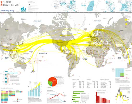
This example isn't half as bad but I still do not enjoy the fairly boring layout, it is possible to display a lot of information in a simplostic way without producing huge lists and graphs.
Infographics - some GOOD examples
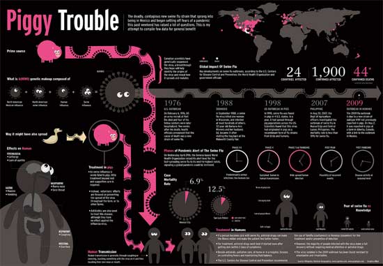
I love this, the colour scheme is really effective and in short, it is just really interesting to look at, I aim to produce something that is hopefully as visually appealing as this, so that it comes across as art. before information.

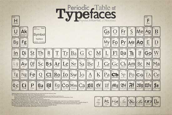
I also like this example, it is clear and concise, with a very effective colour scheme. It isn't the most complicated, but it utilises simplicity very effectively.

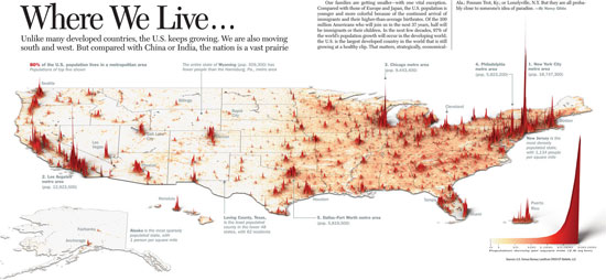
This diagram is fairly useful, I like how (even though it does not have to give a large amount of information) it displays it's purpose clearly and is visually appealing.

Infographics
I have come to the conclusion (from trawling through hundreds of pieces of information design) that I particularly like the style of infographics, I'll use this blog to show research into my task, with most practical work being digital/sketchbook based.
The information that I have decided to base my work around is from this website http://www.wttc.org/eng/Tourism_News/Press_Releases/Press_Releases_2003/Latest_Statistics/
It's basically just a big boring list, but it gives me the data to design around.
I'm yet to come up with a real concept behind this work, but I'm sure I'll come up with that soon!
Oops!
I have about five draft posts that I used in preparation for researching my presentation but they really are not worth posting! As for the one below this, it had also been sitting in the draft posts pile for weeks.. I need to keep up to date :) Now I'm in the run up to deadlines I should do this a bit better, hopefully from now on I will post things when I actually write them rather than three weeks later.


Monday, 21 March 2011
Project
This purpose of this blog is to show the research and development for my university module entitled 'Information Design'. The outcome will be to create an 'Information Landscape', this will be a design solution to organise information. It is a digital project and this design solution must be able to hold a vast amount of information on one screen yet still look visually pleasing; it must also comment on a particular subject and have a contextual meaning.
The subject I have chosen to work with is Travel.
The subject I have chosen to work with is Travel.
Subscribe to:
Comments (Atom)